A post about typefaces
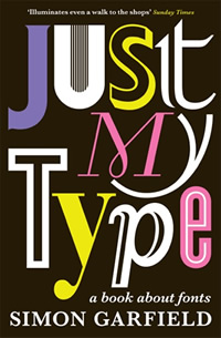
Last year I read a fun book all about typefaces/fonts that I picked up in a charity shop.

It was a few months ago that I finished reading it but to both refresh my memory and as a way to share some of what I learned here is a rambling post on the topic.
Why is this interesting?
Typography truly reflects the whole of human life… a direct visual representation of the tone of voice with which we express the spirit of our time.
*Fab colleague Laurence read this post and suggested a post of popular fonts would help readers conceptualise what a font is. I aim to please. Enjoy!
Typeface vs font
The vast majority of people use font and typeface interchangeably to mean the same thing. Unsurprisingly confusing as we have software programs that have a drop down saying “font” where you can pick dozens of fonts/typefaces. There is however a difference.
As I understand it typeface is a complete set of characters with a common design ethos (e.g. Arial, Georgia, Gill Sans). A font denotes the specific style, size, weight of a typeface.
Thus Helvetica is a typeface but the font could be Helvetica extra-bold or even if the typeface comes in italics.
There is a fascinating history related to printing which you can check out, or you can just keep saying font and not worry about it.
Comic Sans

Started as a child-friendly/more informal typeface for Microsoft. The designer worked with the team behind BOB and thought Times New Roman didn’t match the message the software wanted to send of warm, friendly and accessible to those new to computing. Heavily influenced by comic books, especially The Dark Knight Returns. It got so popular that public opinion shifted and is now a source of mockery.
Don’t be a hater though… it’s actually a great typeface for those with dyslexia.
Legibility vs Readability
Legibility is about the ability to distinguish characters (/ glyphs) from one another. Characters width, weight, height and its use of serifs all affect legibility.
Readability is more broad, it’s about how the type is arranged. This can be affected by type size, type case, colour and contrast.
Maybe this site describes it better…
Readability is how easy it is to read words, phrases, blocks of copy such as a book, a web page or an article. Legibility is a measure of how easy it is to distinguish one letter from another in a particular typeface.
Source: Sitepoint
The wrong choice of typeface/font could wear out a reader. Some type/fonts perform better than others.
Measuring readability
There are a lot of measurements of readability. Just because something may be legible or readable doesn’t mean it’s always the right typeface. As the book highlights some things are “to be seen rather than read”.
Swiss type designer Frutiger might disagree though…
“If you remember the shape of your spoon at lunch, it has to be the wrong shape. The spoon and the letter are tools; one to take food from the bowl, the other to take information off the page… When it is a good design, the reader has to feel comfortable because the letter is both banal and beautiful.”
Pruning
Typefaces may not destined to be universally more readable than others. It seems according to Licko “you read best what you read most”. Thus we think that Arial or Times New Roman is easy to read because we do it so often.
I’ve been reading some books about neuroscience recently and can see a link to the idea of pruning. Our brain gets better at performing tasks we repeat regularly and dumping ones we don’t do or do rarely. Seems similar, although might fall apart if you ever tried to just read everything in Windings for 5 years.
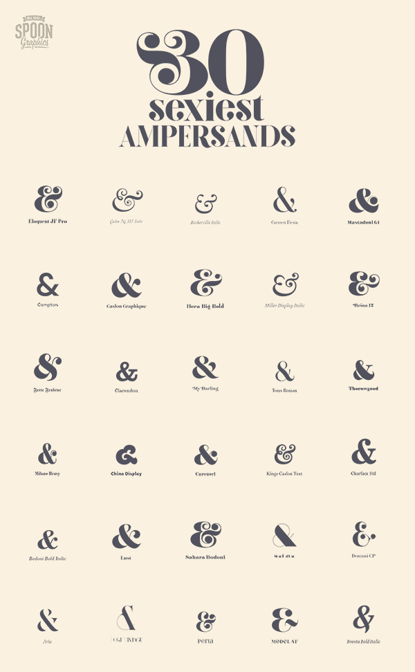
& = and
It originated from the latin “et”. It’s shape is the two smushed together (with some evolving design flourishes over time).

I’ve got a new found love for how beautiful a & can look. Some are beautifully flamboyant.

Source: Spoon Graphics
Johnston
The typeface of the tube has a rather wonderful ‘i’. Here is an example with Gill Sans below.

I love the little diamond.
Transport
The typeface transport has a great story too. Not only is half the combo behind it born in Durham but they had to battle it out with another potential typeface to win the Ministry of Transport contract.
They prototyped & tested it in Preston and on the M1. They even had a little contest at RAF Benson Airport in Oxfordshire. “They got several airmen to sit in chairs on a platform… and on the top of an old Ford Anglia they’d fixed these test signs with just two destinations on them, and they drove them towards these airmen and they had to say which ones they could see or read first”.
Metro
The same wonderful Margaret Calvert who helped to design Transport also helped to create Calvert. A font originally created after Calvert and type designer partner Kinneir won a competition to design all graphics and communications for a new town in France, Saint-Quentin-en-Yvelines. The issue was the French town rejected it, saying it looked too English. One’s loss is another’s gain and it eventually found its way to the Tyne and Wear metro system.

g

When curious individuals are stumped and trying to decipher the typeface they usually go to the g. The g is apparently the character that type designers typically let themselves go. If you want to see a flourish then look at the g.
Making typefaces
Bodoni 200+ years ago said;
Letters do not achieve their true beauty when done in haste and discomfort… nor when done with diligence and pain, but only when created with love and passion.
I wonder if it’s true for creating services and products.
Type Archive
You can find the Type Archive not far from Stockwell tube station. They have an “amazing collection of letterpress fonts in metal and wood which celebrates the joy of printing: the craft that has served as the fundamental basis of modern civilisation and graphic design”. On my list to visit.
Other posts
This probably isn’t useful or interesting but others write more interesting things about type and the web. I recently read a post on performance and typography but i’ll let you go discover the rest…